
digipak analysis

The page is full of words and writing to give the piece a rough and urban feel , showing its genre which the audience can associate with quickly.
The font which has a roughed out ‘Scratched’ style helps to identify the genre of music the band is, which can help with audience appeal and general recognition within retailing stores.
The overall appearance of the album is very crowded and overlapping, suggesting chaos, again linking to the meaning of the album.
he repetition of the title ‘Riot’ around the page makes the name easily remembered. It also provides a simple yet effective background that is colourless making the orange of the title and band information stand out, which is a very effective technique.
The small print about the record label etc. is in a different font to the rest showing that it is of importance.
paramore - riot!
Paramore's second album Riot! was released in 2007.

The barcode is positioned on the top right hand corner of the back cover of the cd. The text wraps around both the barcode and the image of the band, and this is effective as it means that there is no blank space, further supporting the image of chaos.
The main focal point on the album cover is the black and white sketch like photo of the band along with the bold orange writing reading "Riot!" presumably the name of the album. The photo is a high angle shot, connoting they are addressing a bigger or more authoritative power, which links to the meaning of the album, suggesting rebellion and fighting back.
The large image on the back makes it recognizable its a paramore album. Since this picture is shot in human view at eye level , this shows that the band is addressing to their fans or audiences with which they have a more friendlier gesture.
The consistency of theme is evident in this album as the same fonts, colours and layout are used thoroughly throughout the digipak. This makes the album look more uniform and professional.
The colours used in the album are very common to the genre and to the band specifically (the lead singer has orange hair). Because it links to the genre, it can make the album very identifiable as to what genre it belongs to.
twenty one pilots - blurry face
The duo do feature within the digipak, however only in the booklet on the inside casing. The colours used in the photo are matching with the rest of the album which, makes it look uniform.
The twenty-one pilots are a duo who are typically quite difficult to affiliate to a specific genre as they bridge so many.
As well as the colours being in keeping with the colours of the band it also reflects the genre of music, typically alternative pop and indie pop use dark colours.
Twenty One Pilots' Blurryface is the fourth album released in 2015 by the American duo.

The patterns within the circles could be a symbol of the different genres within this one band, and the different ideas and motifs they choose to emphasise. The pattern on the CD is the bands logo, again making it distinguishable. The reason for their faces not being on the album could be because they would rather their fans appreciate the music rather than them - which is typical within the alternative genre.
The colours used on the digipak are consistent of the colours that the band members wear and were included in their music video, this makes the album easily identifiable. The artwork is representative of the band members – Josh Dunn tends to be associated with red (e.g. his red hair). Where as Tyler is generally associated with black (he is frequently painted in black for his performances and music videos). Their music includes synthesisers, drums, piano (sometimes electronic keyboard), ukulele is also featured and a mix of vocals (sometimes rap, they also include screamo).
arctic monkeys - wpsiatwin
The colour scheme of this digipak again reflect the overall style of the band, the grey and black colours symbolise dark and depressing things. This in a sense is what the band songs are about; they are not about a typical boy bands song, which involves falling in love with girl and a song about their beauty. Instead, the band sings about possible heartbreak in a way that we as an audience would feel. The colours represent the Arctic Monkeys bands ‘down to earth’ style.
The text is wrapped around the photo, making the photo clearly the main focal point of the album. The man in the photo shows some distress suggesting that the album isn't going to be light-hearted - it is more serious.
Arctic Monkeys' Whatever People Say I Am, That's What I'm Not is the official first album released in 2006.

The man on the front and back of the CD cover reflects how the Arctic Monkeys see themselves as a band; they portray themselves as average people almost like ‘working class’. They have done this to appeal more to their target audience and to in some respect prove that fame hasn’t got to their head and they are not the stereotypical ‘boy band’ instead they are in a way darker than that and hit on real issues in their songs. They are trying to suggest that they have not made this album for the fame and fortune instead they have made it for the fans.
Not only is the man on the front of the cover representative of the band as a whole, it mirrors the possible target audience of the Arctic Monkeys. This way by having what seems to be the ‘average’ working class man (smoking, normal clothes standard hair cut) makes the target audience feel that the album is more for them rather than the upper class who are targeted by other styles of artists in various different ways. However this man could have been put on the front cover of the CD to try and show new possible fans at a glance what the band are like in a sense, all through the image and stereotype off the man on the cover.
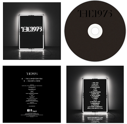
The 1975 - self titled album
The 1975's self titled album was their first official album released in 2013.
The illuminated square is the most eye catching part of the cover, along with the illuminated logo of the band name. The square is an iconic image of the band as it is used in the sets of their performances as well as being featured in some of their music videos.
The all black cover represents the style of the band as well as working well with the bright white to make it standout and although is very simple, sums up the bands image. The inside of the album folds out to reveal two landscape, similar images of the band in black and white. Black and white being the constant colour scheme of both the band their album, it reflects their cool, laidback personas as they are not in the business to be famous. Fans will again recognise the black and white theme as this is in many of their music videos.
The band are wearing laidback, dark clothing which many people would wear day today as well as many indie bands who wear plain, casual clothing. Again like the cover, the font style is simple, yet more modern to reflect their music which has a modern influence. The block capitals and two lines, are something which is iconic to the fans as the band use this style on all their social media, such as twitter.
The black and white again is used to maintain the simple theme of the cover. Like all album back covers, they have a clear track listing, and production details which are in a small print at the bottom as many fans will not be interested in this aspect. Although black has connotations of heavy metal, Goth music, they surprise the audience with a pop element to their music. Like many indie bands they do not feature themselves on the cover as they find their music is more important than them being recognised.